AVEE · Safety navigation · Rio de Janeiro · 2026
AVEE
A walking router for Rio de Janeiro that picks the safest way, not the fastest.
said “few people around” was what made them change a walking route.
Avoiding empty streetsSix different buttons became one token-driven primitive with four variants. The implementation of a design system brought consistency, and it also stopped the agent quietly inventing its own.
Consistency by contractAn advisor came on board early. She founded a startup in the safety space, raised from Lovable, and got to 50,000 paying users. Her feedback has shaped the product and how it goes to market.
Backed by proven expertiseCase snapshot
It started on a walk home.
I spent three months in Brazil learning how to build with AI.
The idea came walking home one night. A few minutes off the main road the street changed. Fewer people, more residential, darker. Nothing happened, but I remember the exact thought: a motorbike could stop in front of me here and take my belongings, and there is nobody around.
I wasn’t in a hurry. I had nowhere to be. I would happily have walked five minutes longer to stay on a street with people on it — and Google Maps had no way to offer me that. It optimises for time, which was the only thing I did not care about.
Before building it, I validated the idea with 10 people.
I ran a survey before designing anything. Ten responses, seven of them visitors. Eight had changed a walking route because of how a street felt, so I asked what made them change it.
Eighty percent picked one of two answers that mean the same thing: nobody is out here. Crime history is the obvious place to start when you are scoring a walking route. It turned out to be a long way down the list of what people actually respond to.
80% gave the same answer in two forms: nobody is around. Street lighting, which I had built the score around, got nothing.
Asked: “What made you feel unsafe and change your route?”
Ten responses, seven of them visitors. Too small to prove anything, big enough to change my mind.
One person with time to spare.
Tourists walking around Rio who want to avoid dark, deserted streets.
Not locals, who already know which blocks to skip. Not drivers. Not anyone in a hurry. Every design decision got easier once I was designing for one person: a tourist on foot, unfamiliar with the city and with time to spare.
The challenge of designing for safety.
The hardest part of designing the interface is being transparent without sounding too confident about the data, or making people feel afraid just because they see historical crime information about a street they may cross.
AVEE’s goal is to give users the information and tools they need to make their own decisions. Safety stays in their hands; AVEE supplies the information and the context.
The main design principle is to be honest and transparent. AVEE does not exaggerate what the data means, and it does not promise more than the app can deliver.
Colour the route, not the city.
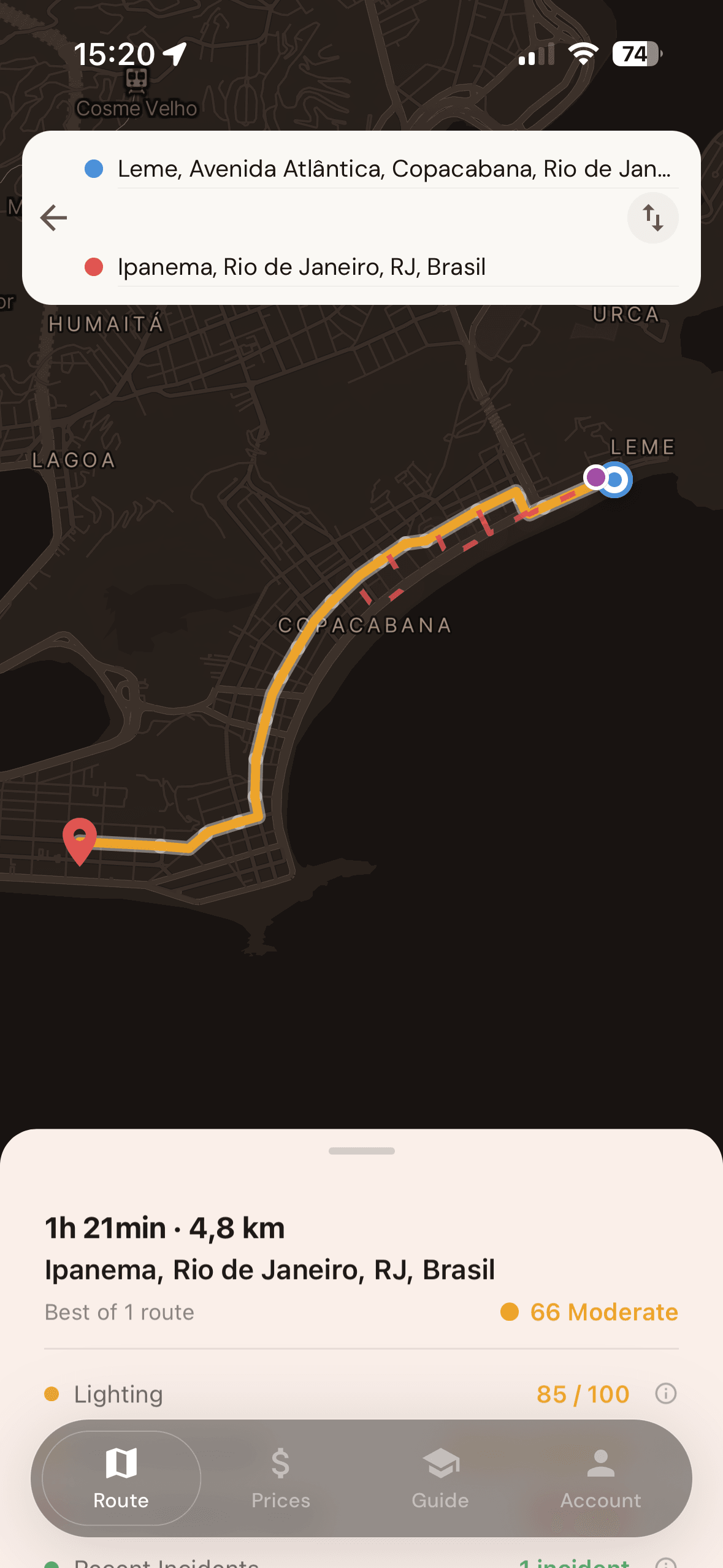
The map scores your path segment by segment. It never paints a neighbourhood red. A heat map tells you which communities to be afraid of. A coloured route tells you where to walk. Same data, very different thing to hand a stranger.
Say the level, not just the number.
Every score comes with a word next to it: safe, moderate, caution. The number claims a precision the data does not have. The word is the decision someone is actually making.
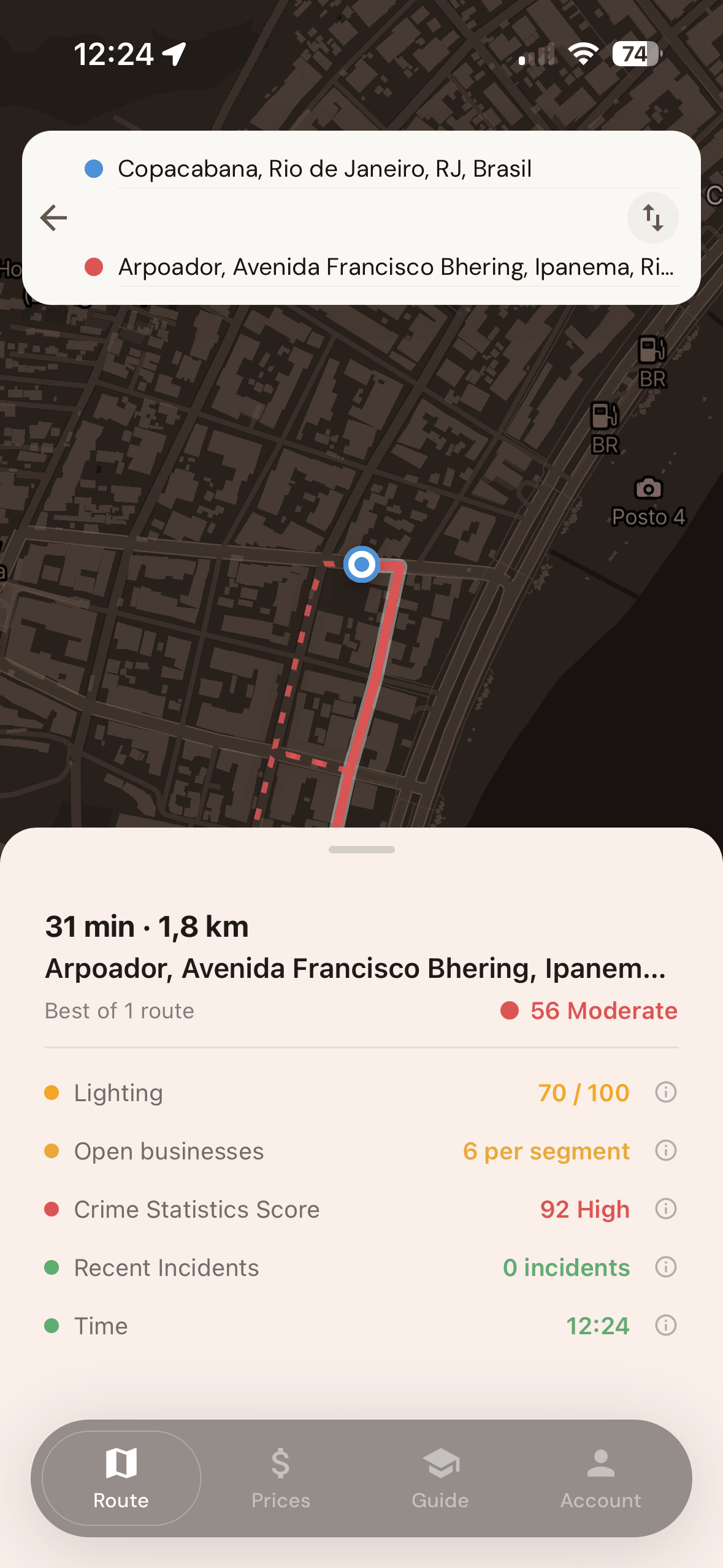
A constant feedback loop.
Having the app on my phone made it easy to test with people around me. There are almost no established patterns for a safety score, so watching someone read one for the first time is most of the work.
The feedback I got on the first design direction was that it was too dark and did not remind people of the safety space. The more I learned about the target user, the more I noticed that it did not resonate with them. Brands like N26, Revolut and TripBFF were the ones that fit my audience, so in the next iteration of the design direction I took a more human, young and transparent approach.
Drag the handle to compare.
The design system is the contract with the agent.
When you build with AI agents without a design system in place, you ask for a modal today and a card tomorrow, and you get two greys, three corner radii and a font weight that does not exist.
So the design system here is not documentation. It is the constraint that makes generated work safe to accept, and it cuts the time spent fixing the kind of inconsistency a good design system prevents in the first place.
Tokens are the single source.
One token file holds every colour, the type ramp, spacing on a 4px grid, radii and gradients, derived from Figma. Screens import tokens. Screens never hold values.
Components are primitives with variants.
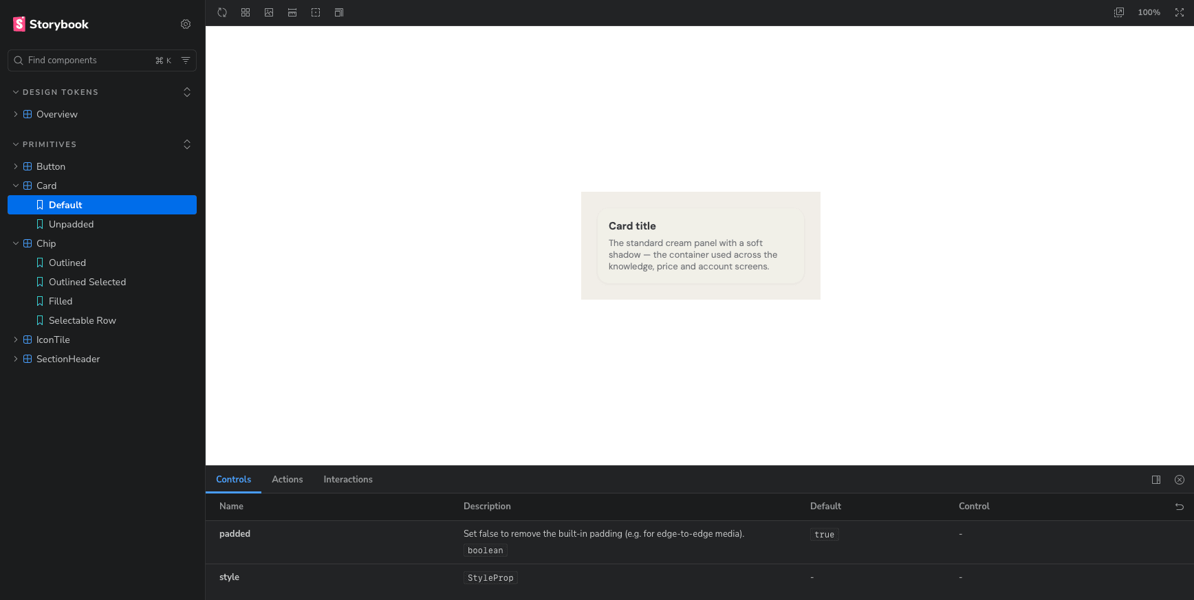
The Button primitive replaced about six hand-rolled button blocks scattered across auth, map, modals and onboarding. Four variants now cover every CTA in the product.
Storybook renders everything.
Every component and every token, so drift is something you can see rather than something you argue about in review.
How I work with AI.
Three repos, all built with agents.
Every repo has a checked-in docs folder and a house-rules file the agent reads before touching anything. Notion holds the summaries, the links and the knowledge centre — never the specs.
Evals are design QA.
An eval is a written answer to two questions: what should this do, and how will I know it did. The file lists what would matter if it were wrong. A wrong score. An unsafe route. A stale cache. A data source failing. A segment with no data at all. Each one gets an input, an expected output, and a note on whether a test covers it yet. Thirty-nine so far.
Next steps: testing real-world value with real users.
The testing so far has been about the interface: how people read the information, whether they could finish the main tasks. But that tells me little about whether the product is worth having. For that it has to be used in real life.
So there are two groups: locals and tourists. Locals are not the target user, but they already know where it feels safe to walk in Rio, which makes them the right people to pressure-test the scoring. The goal is 30 users and 20 completed surveys.
With the surveys and product analytics, some of the questions I want answered are:
- 01Did the app change how users actually move through the city — routes, timing, areas avoided?
- 02Do users trust the safety recommendations enough to act on them in real situations?
- 03Did using the app change how anxious users feel about getting around the city?
- 04Would users recommend it to someone they care about — and why?
Making the survey worth finishing.
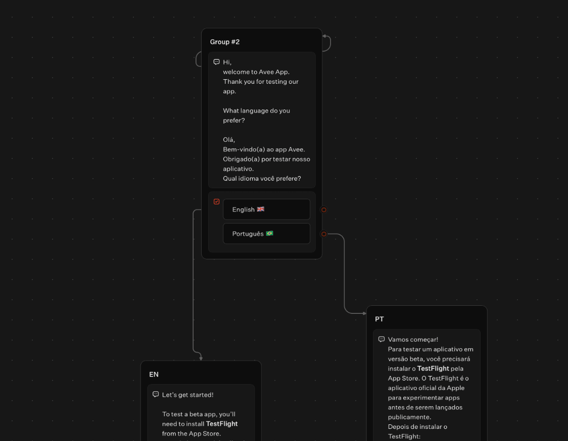
I started with a form that ran to eleven pages. Going through it with my advisor, it was obviously far too long. These testers are friends and friends of friends. Nobody is paid, and there is no voucher at the end as we had at Vistaprint. The research has to cost them almost nothing, so I dropped the form and moved to Typebot, a chat-style survey that is short and feels like a conversation.
What is waiting for us after testing the beta version?
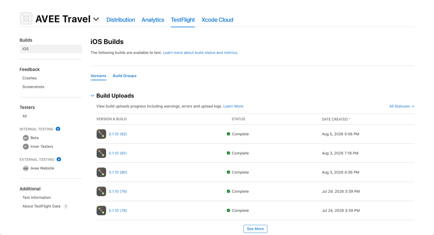
After we get the 20 completed surveys I will analyse and synthesise the data to understand what improvements I should make to the product. Then I will implement the paywall, run internal testing, and launch officially with the help of my advisor. The official launch is planned for mid-September 2026.